Be Employment Law
When Butcher and Evans decided to combine forces and create their own law firm, they knew they wanted to be different. There was a clear format as what a ‘typical’ law firm looked like, and they were keen to diversify from that mould. Mount Deluxe were brought on board to forge the new path for the firm, starting with a strong foundational brand story, and linking through to a unique visual identity.
The founders of the firm were already bringing exceptional technical skills to the table; between their knowledge and experience, they were a highly credible team who could easily and expertly ‘get the job done’. Together with Mount Deluxe, we polished the core values that set them apart and made them so special – respect, kindness, genuine connections, integrity and loyalty.
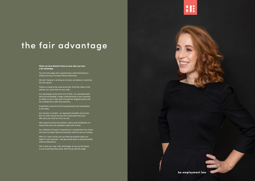
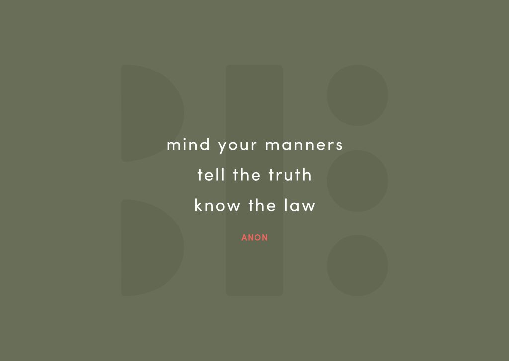
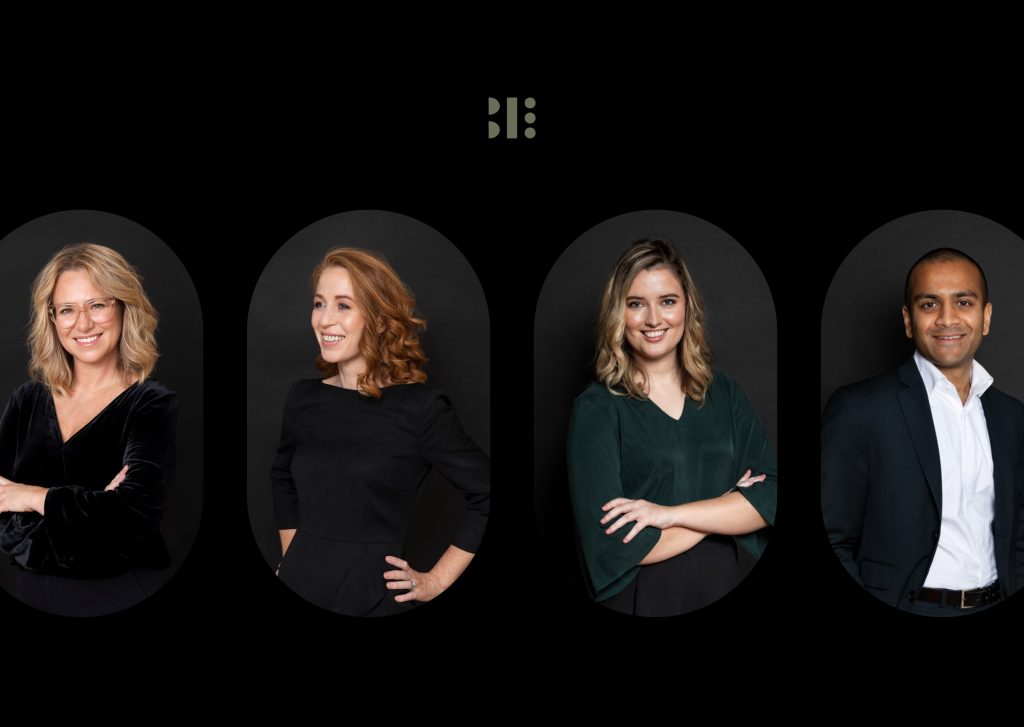
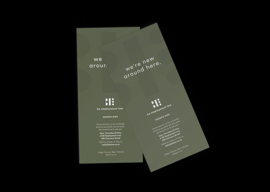
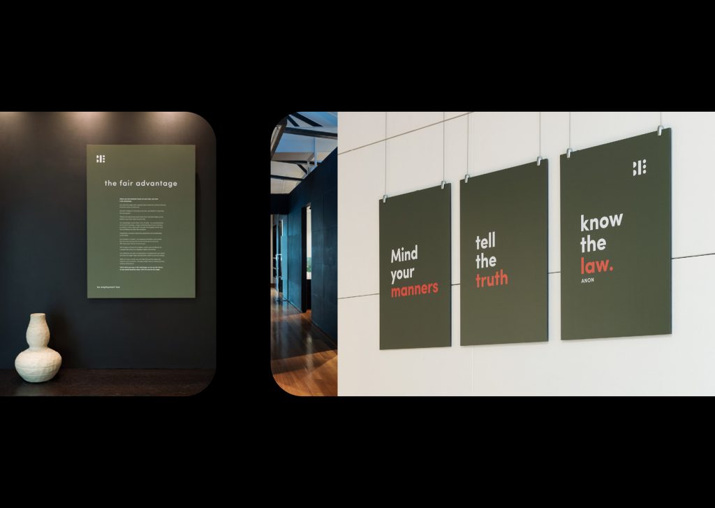
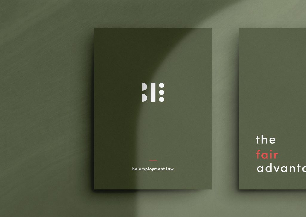
These notions were reflected not only through their brand story (succinctly wrapped up in their tagline, ‘the fair advantage’), but through their visual language. Their logo consists of an icon crafted from circular shapes to create both the letters ‘B’ and ‘E’, while also representing seats facing each other across a table. The more rounded shapes also allude to the soft heart of the brand (rather than harsh, cold lines). When it came to colour, Mount Deluxe paired a sophisticated, earthy olive green with a kick of bright coral for energy. As the brand unfolded, the new BE Law look was rolled out onto a custom website, office art, staff photography and all of the business collateral that a law firm requires.
